
Have a Seat is an established Event & Floral Design company with a longstanding, successful event rental business based in Canada, who came to Ceci New York looking for a brand refresh! Their company had been using the same logo for many years, and had tried evolving it on their own in order to give themselves a brand update. However, they felt the look of their branding was starting to feel a bit disjointed and inconsistent. Ceci New York first focused on the primary goals of their business, in order to successfully position them within their market and spearhead their logo design in the right direction. Ultimately, the event rentals side of the business emerged as the clear focal point, so Ceci New York focused on developing a brand mark that captured this side of their business in a sophisticated way. By playing with the various shapes of the rental chairs the company was known for, a new mark was created that is meant to be evocative of those shapes in an abstract, luxe way. The cross of the "H" in the center of the mark is also evocative of the seat of a chair, playing off of the double meaning in their name, as well as the shapes in the mark itself.

Initial design concept sketches

Business cards - featuring gold foil stamping on a luxe, white paper front and cobblestone gray paper back.
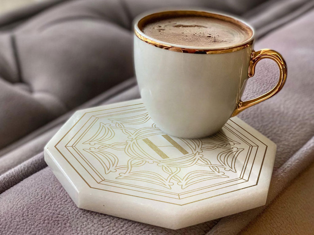
Branded marble coasters with the Have a Seat logo mark.